maurograziani.org
Music Art Technology & other stories


Posted on 20070123 by MG
Informational Art
Representations of science often border on art.
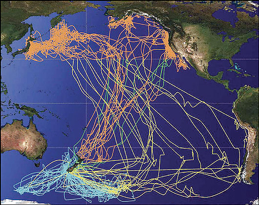
This image from Washington Post, which you can enlarge here, was created by Professor Barbara Block of Stanford's Hopkins Marine Station to track the movements of various marine creatures and bird species across the Pacific.
I find it a beautiful, if artistically naive, example of informational art. A category that perhaps doesn't exist, but should. An art that, while also producing something beautiful to look at, gives us information about what's happening on the planet.
Is it so difficult to place screens in large cities that update in real time and represent, with shapes and colors, a series of data that impact our daily or future reality?
What about a map of temperatures recorded in all the world's airports (the data is already online, updated about every six hours) with the ability to see the last 10 or more years scroll by in a minute? Perhaps that way global warming would be perceived by everyone.
And a picture of the stock market trend that's a little less bleak than that series of numbers scrolling by on Wall Street? And what about the progress of government spending broken down by sector, so that everyone, passing by, can see how the government distributes our taxes?
But also less dramatic things, like the migration of whales in the Pacific or the blossoming of cherry trees in Japan?